Challenge
Redesigning a company’s branding can be a daunting task, but it’s essential to stay relevant and competitive in today’s fast-paced market. It´s the first impression that potential customers have of the business, so it’s important to make sure it accurately reflects the company’s values, goals, and personality. It’s important to conduct research and gather input from stakeholders to gain a clear understanding of what the company represents and how it wants to be perceived.
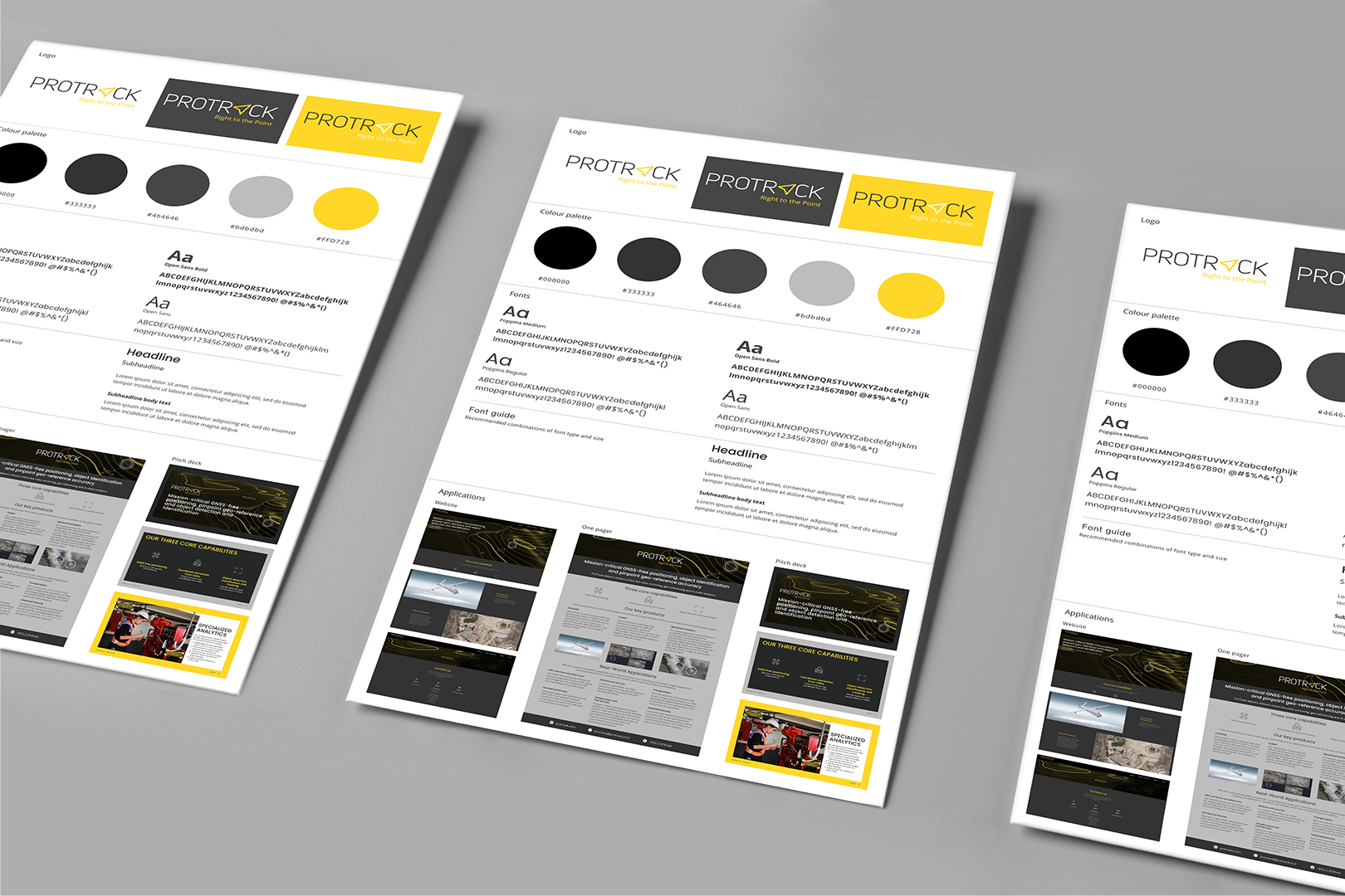
In this case, the company needed a logo update, a new website, a new corporate design, a one pager introducing the company and a pitch deck.
The challenge was to create a new look and feel that aligns with the company’s branding and goals.
Idea, solution
We start with a competitor analysis to understand the industry landscape and how the company can differentiate itself from its competitors. We found that in this case a unique bright color between yellow and orange used as a highlight in all visual media, makes the company stand out in the blue and grey field of competitors.
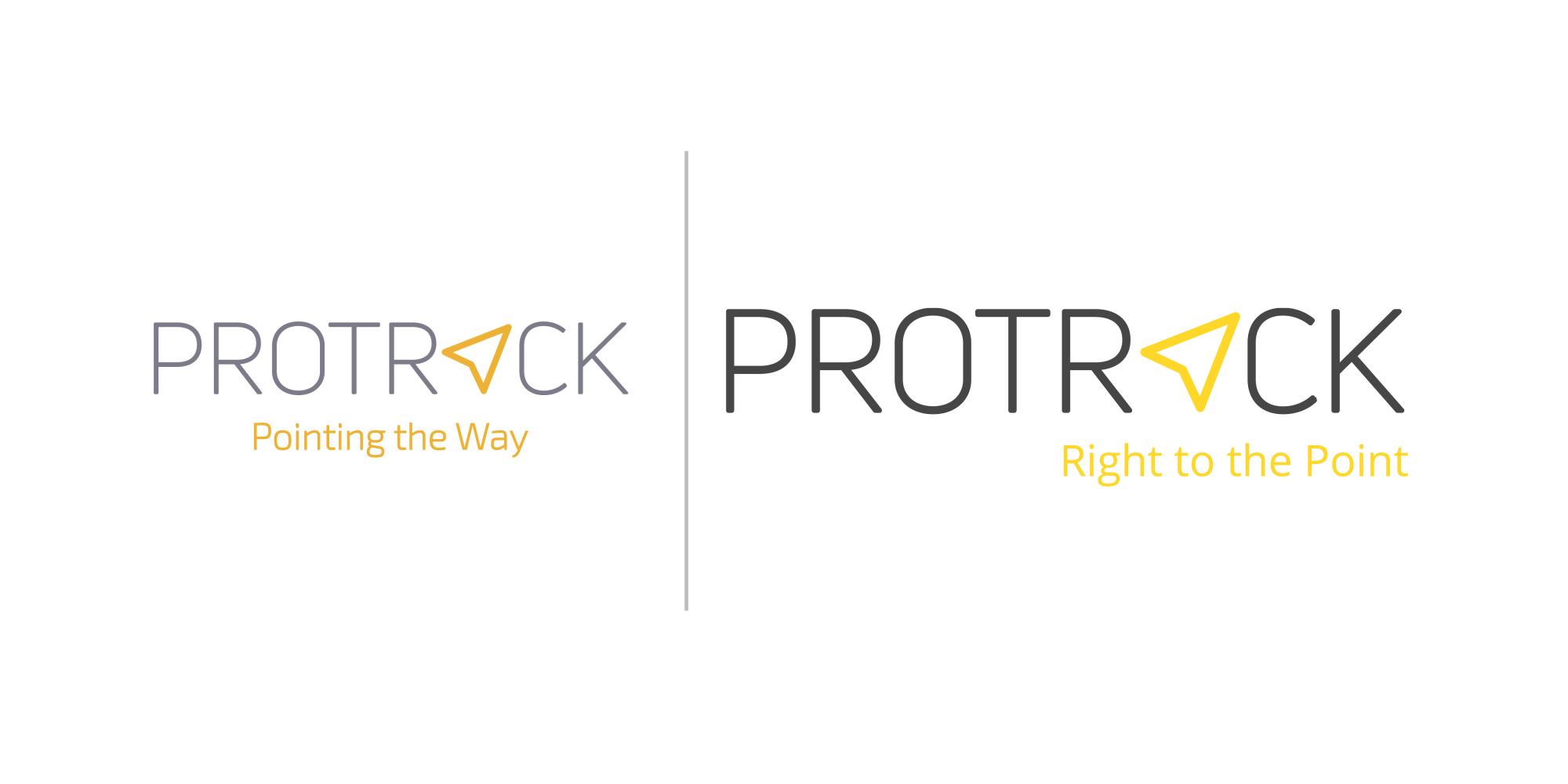
One of the most critical components of a company’s branding is its logo – it needs to work across all media including very small screens, but still needs to be memorable. By enhancing the contrast between the colors in the logo and optimizing the typography we created a more visually striking and easier to read logo – even on mobile displays. We have also reformulated the slogan to be more to the point.
A company’s website is its virtual storefront, and it’s often the first point of contact for potential customers. Therefore we improved literally every component of it: The color palette, typography, the imagery and also the copy. Our team also changed the website’s layout and functionality to improve user experience and engagement.
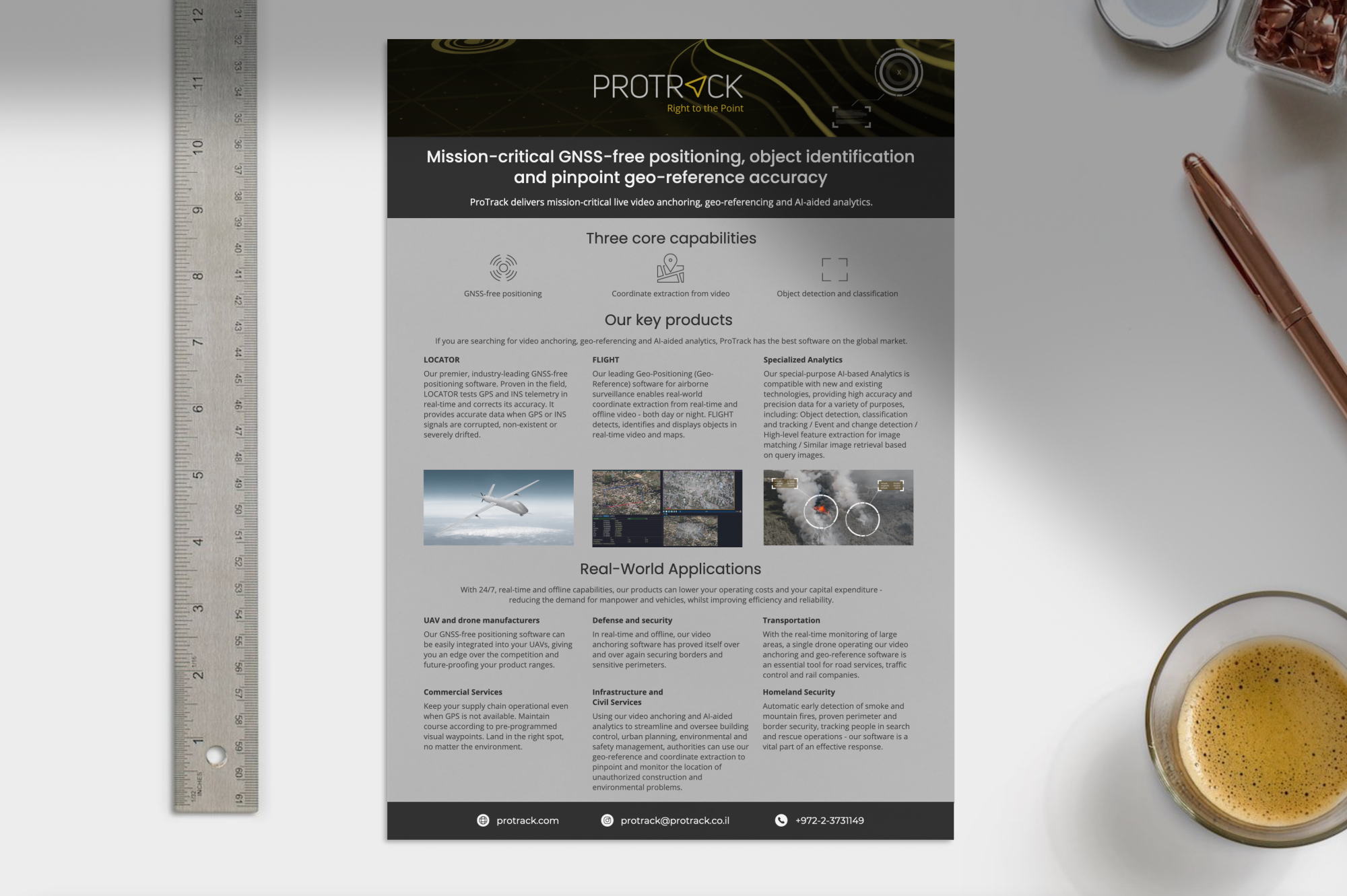
The focus of the one pager was on the balance of the design, content, and messaging. To make it an effective tool for introducing a company to potential customers or investors.
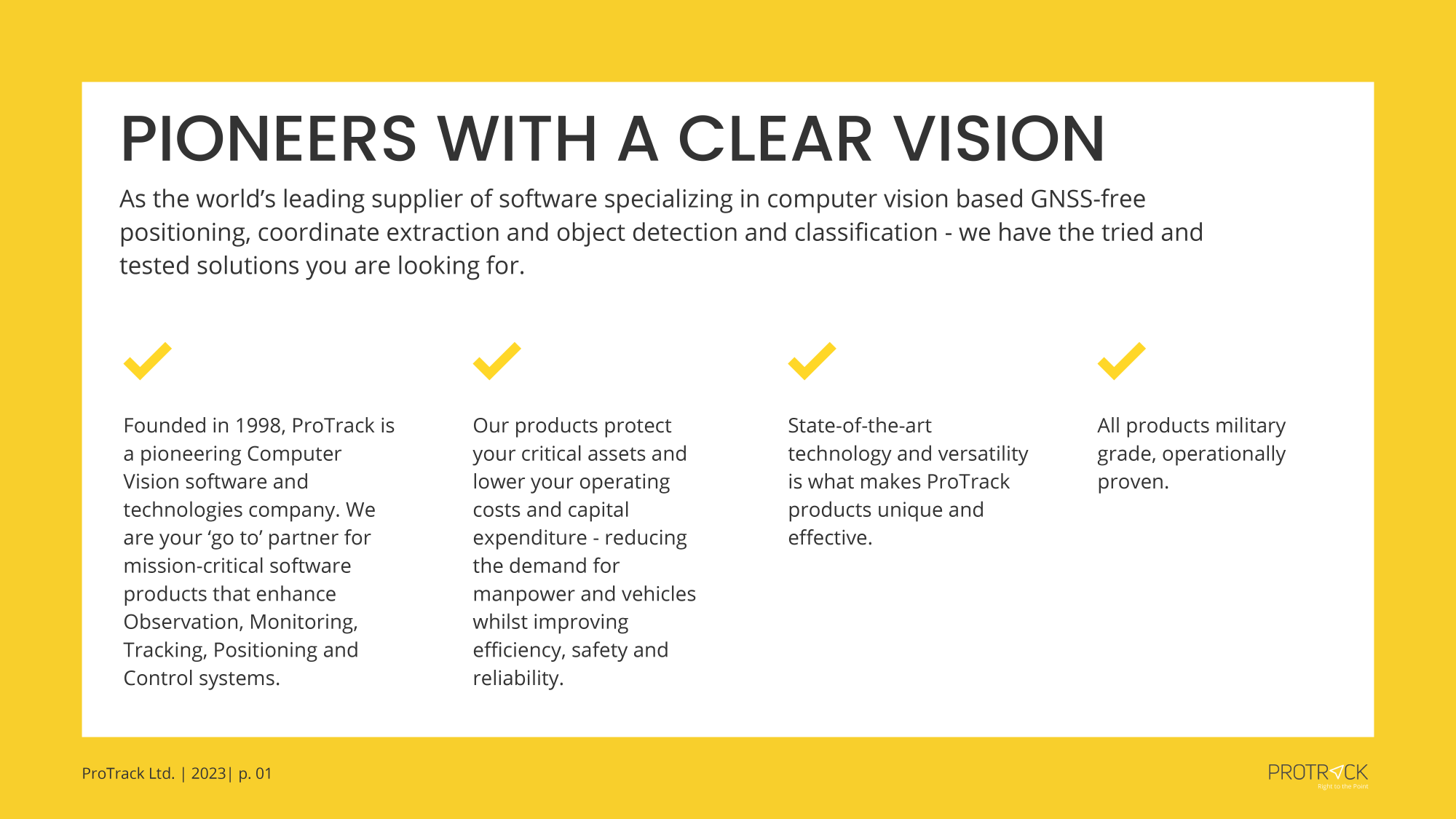
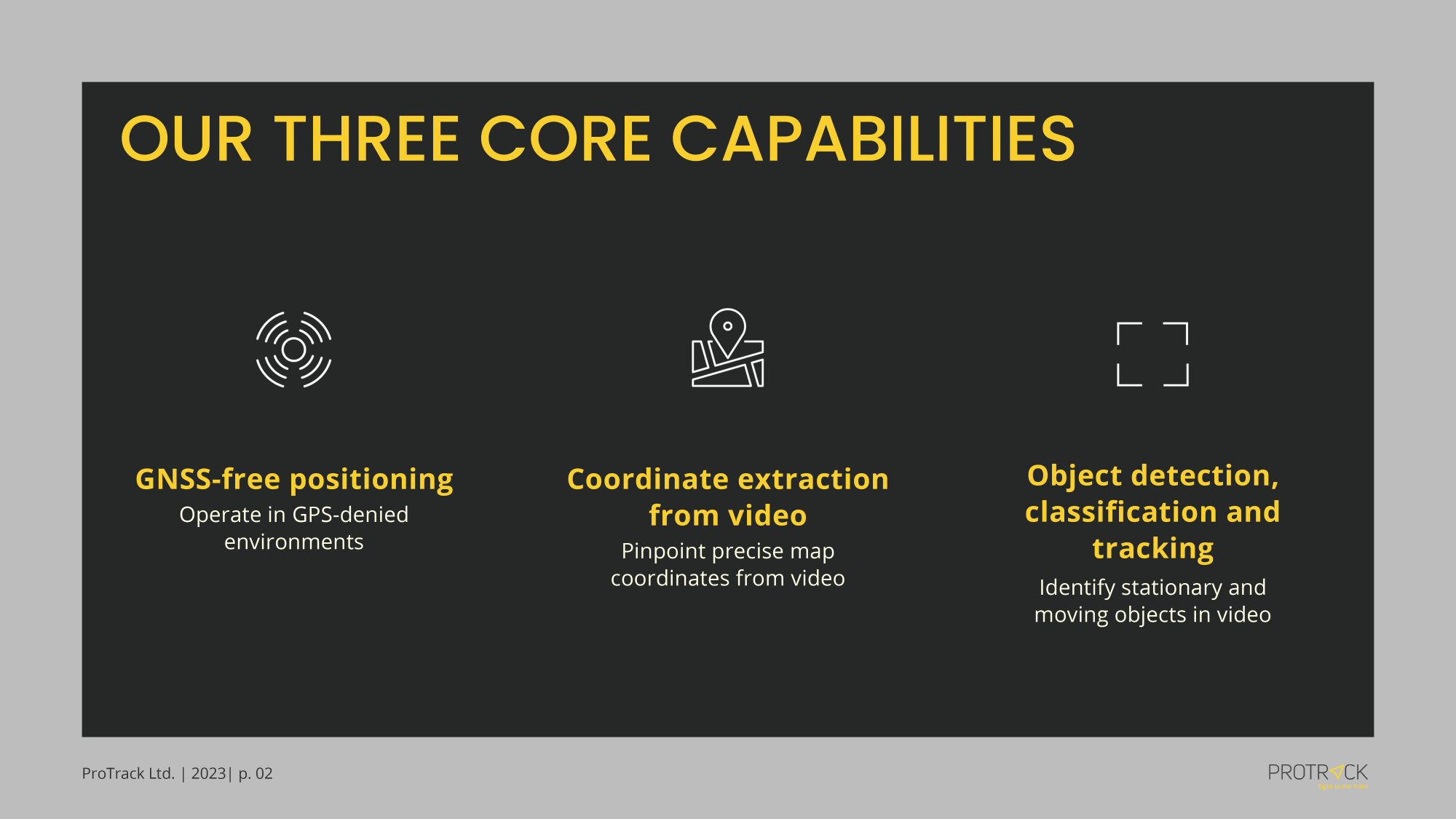
When we created the pitch deck, we made sure that it is easy to read and we work with clear and concise content that effectively communicates the company’s value proposition and competitive advantage.
Result
In conclusion, the redesign for Protrack was a complex process including many branding trades. We adapted the corporate design to different mediums and formats and created a unified, unique visual identity. The website is easy to navigate and use, with clear calls-to-action and is consistent with the company’s branding. The one-pager includes only the essential information and is visually appealing. The pitch deck – with a clear and concise messaging, high-quality graphics and images – is easy to understand and creates a unified message.
In sum, the updated branding shows the core values of the company by the use of a unique color choice for a technology service provider. It reflects how the stakeholder see the company while still ticking all the boxes for modern usage of media.

