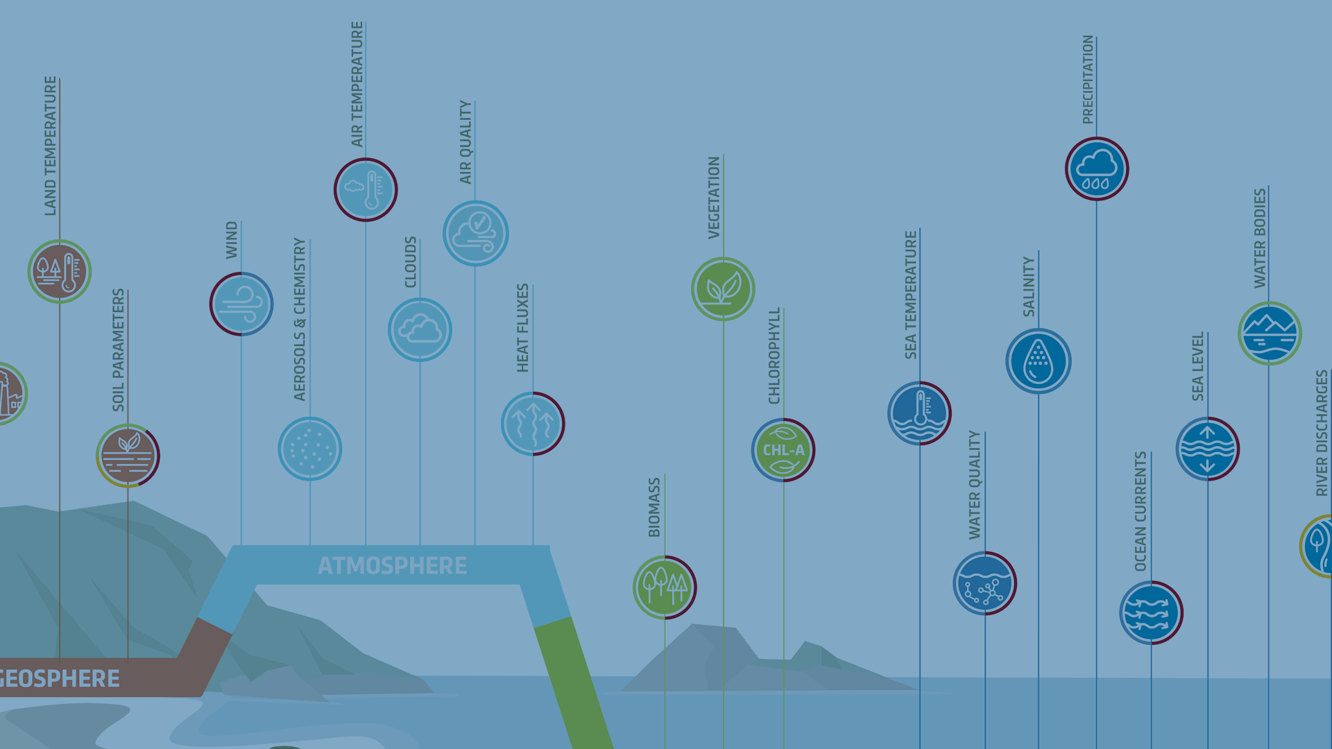
Crafting 'In a Nutshell'Infographics forEarth Observation Data
In the realm of infographics, the concept of 'data in a nutshell' implies presenting information that is clear, concise, and offers valuable insights without inundating the audience with unnecessary details. Explore our approach here.
Explore more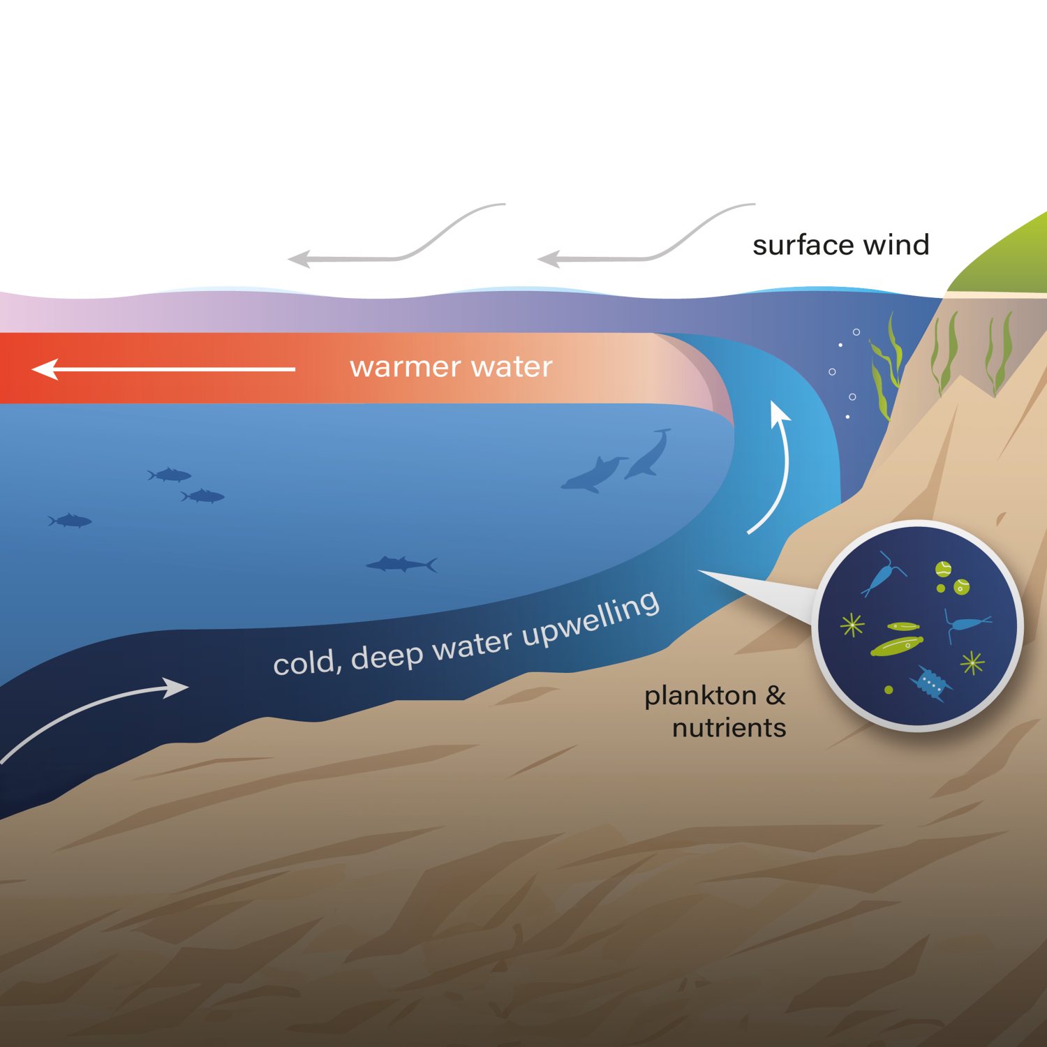
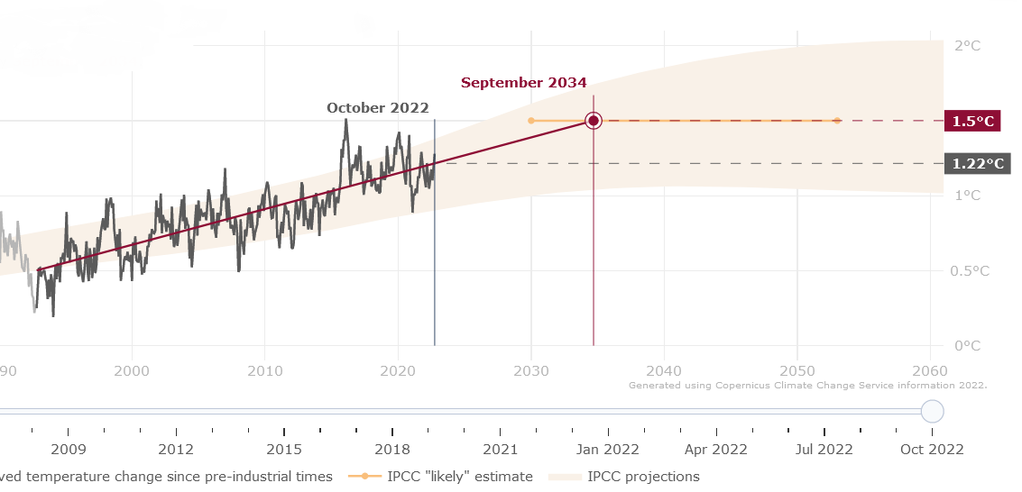
VisualisingGlobal Warming Trendsover time
Collaborating with ECMWF & B-Open, Design & Data developed an interactive application to visualise the current global warming trend in relation to reaching the globally adopted 1.5°C limit.
Explore more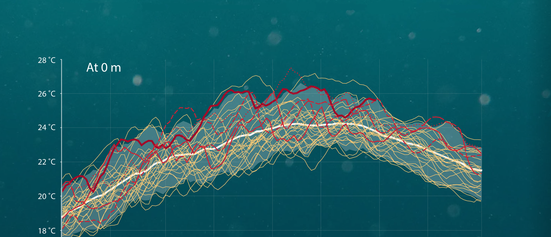
Graphic Design forData Visualisation
Using creative graphic design and programming, D&D created a new version of an infographic highlighting the rise in recent marine heatwaves in the Mediterranean Sea.
Explore more
Developinginfographics forSpace Startups
Design & Data developed a series of infographics using a panel-based layout style for versatile use in long-form websites and short-form social media.
Explore moreDesigning video presentationsfor introducing EUMETSAT operations
To introduce how EUMETSAT uses satellites and monitors weather, Design & Data created an informative video presentation to increase understanding of the brand to visitors at the EUMETSAT headquarters.
Explore more
Creation of theOcean State ReportSummary, Issue 5
Design & Data produced a 20-page summary for the 5th annual Ocean State Report alongside Mercator Ocean International, providing a comprehensive report on the state, variations, and changes in the global ocean.
Explore more