Challenge
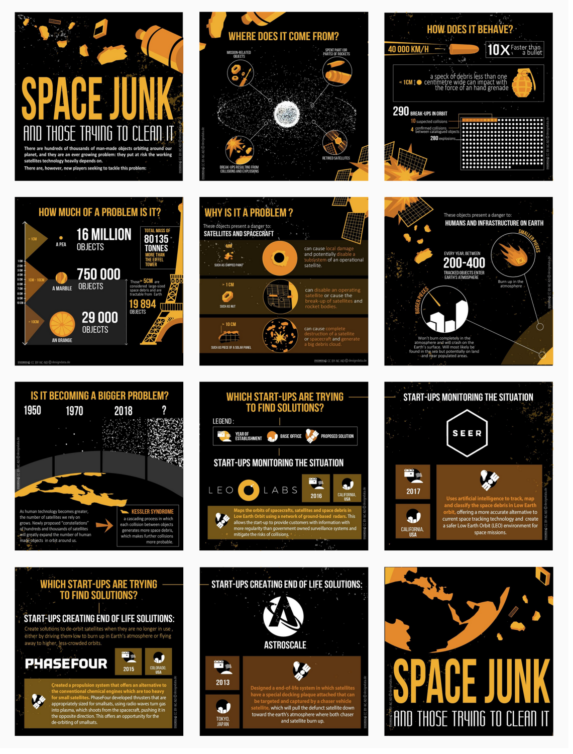
Over the past few years, Design & Data has developed a series of infographics to reach the space startup community through the spaceoneers website. The aim of these infographics was to present detailed space-related information in a visually engaging way to startup companies in the space sector and to convey the information in an interesting format for both web and social media. This posed two challenges, namely condensing complex science topics into easily digestible content that could be paired with explainer graphics and developing each infographic into smaller parts that could be used together in a long-form graphic and individually as short-form graphics.
Idea, solution
Our creative design & graphics team developed each infographic under a different topic that corresponded to a relevant issue or gap in modern space applications, such as climate change, Earth observation, and space debris. We first created short, pithy, and scientifically accurate text copy pulled from research provided by scientific and governmental institutions. This text was then paired with eye-catching graphics that helped illustrate the important data in each infographic while following a narrative structure of identifying the problem, communicating the impacts of the problem, and discussing the startups currently making headway in these areas. However, we also specifically formatted the information in each infographic into easily identifiable “data points”. This approach was extremely important as it allowed us to organise the information int valid stand-alone pieces that could be used for social media (Instagram) and could also work together to tell a larger narrative.
Result
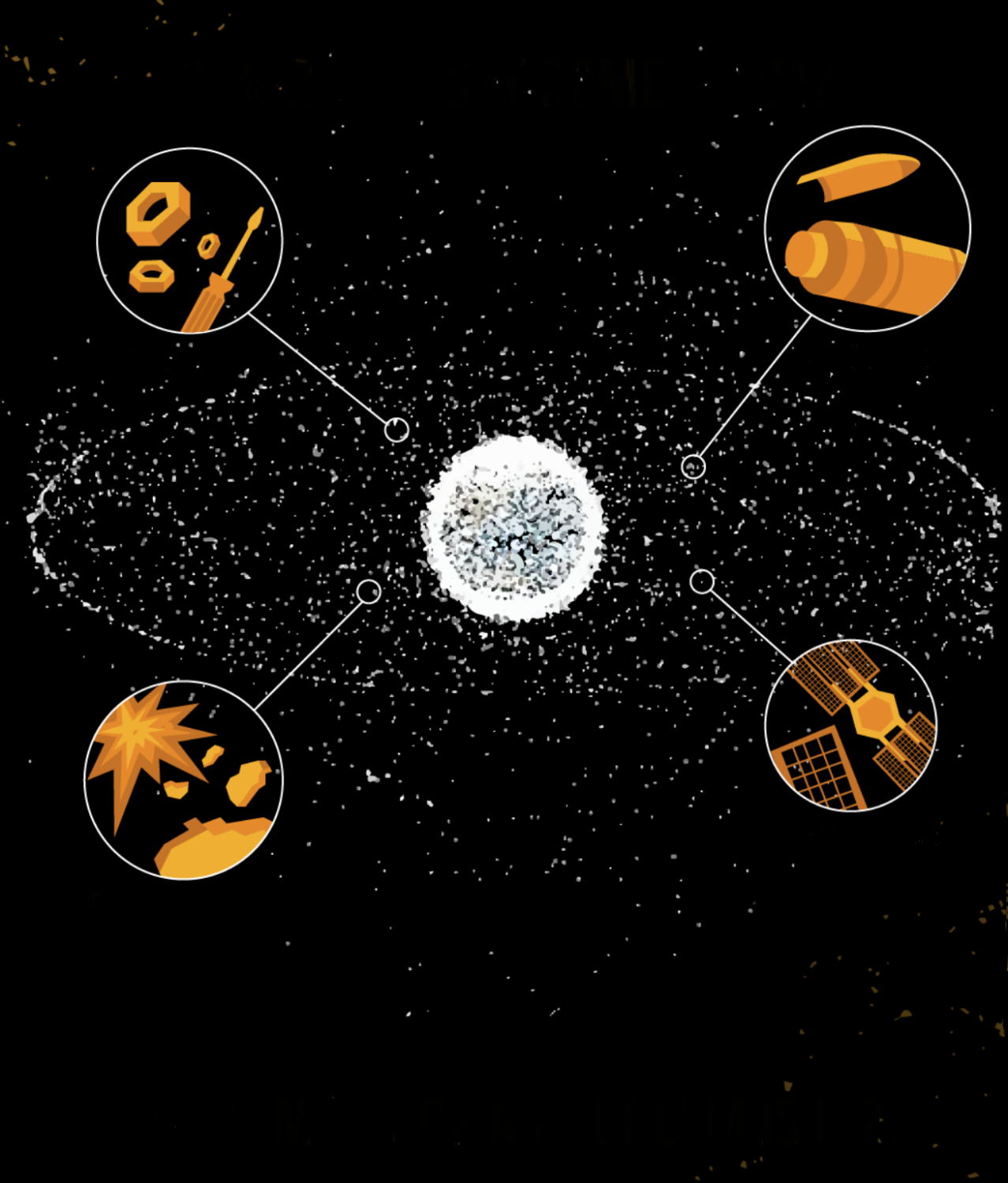
Each of the infographics was published on Design & Data’s Spaceoneers website: a hub geared toward space startups with the aim of spurring creativity and innovation in the European and global space sectors. The accompanying Space Junk and Those Trying to Clean It infographic provides an example of how each data set (e.g., where does it come from, and how does it behave) can be used individually on the Spaceoneers Instagram followed by the long-form infographic, showing how each data set can be used as part of a whole. Other D&D infographics to check out include: 5 Ways Climate Change is Affecting the World, Going Forward to the Moon, Monitoring our Planet: Climate Change Indicators, and Satellites in Numbers.


