Client
Mercator Ocean International
Media
Infographics
Category
Design & Graphic
Location
Cologne
Year
2022
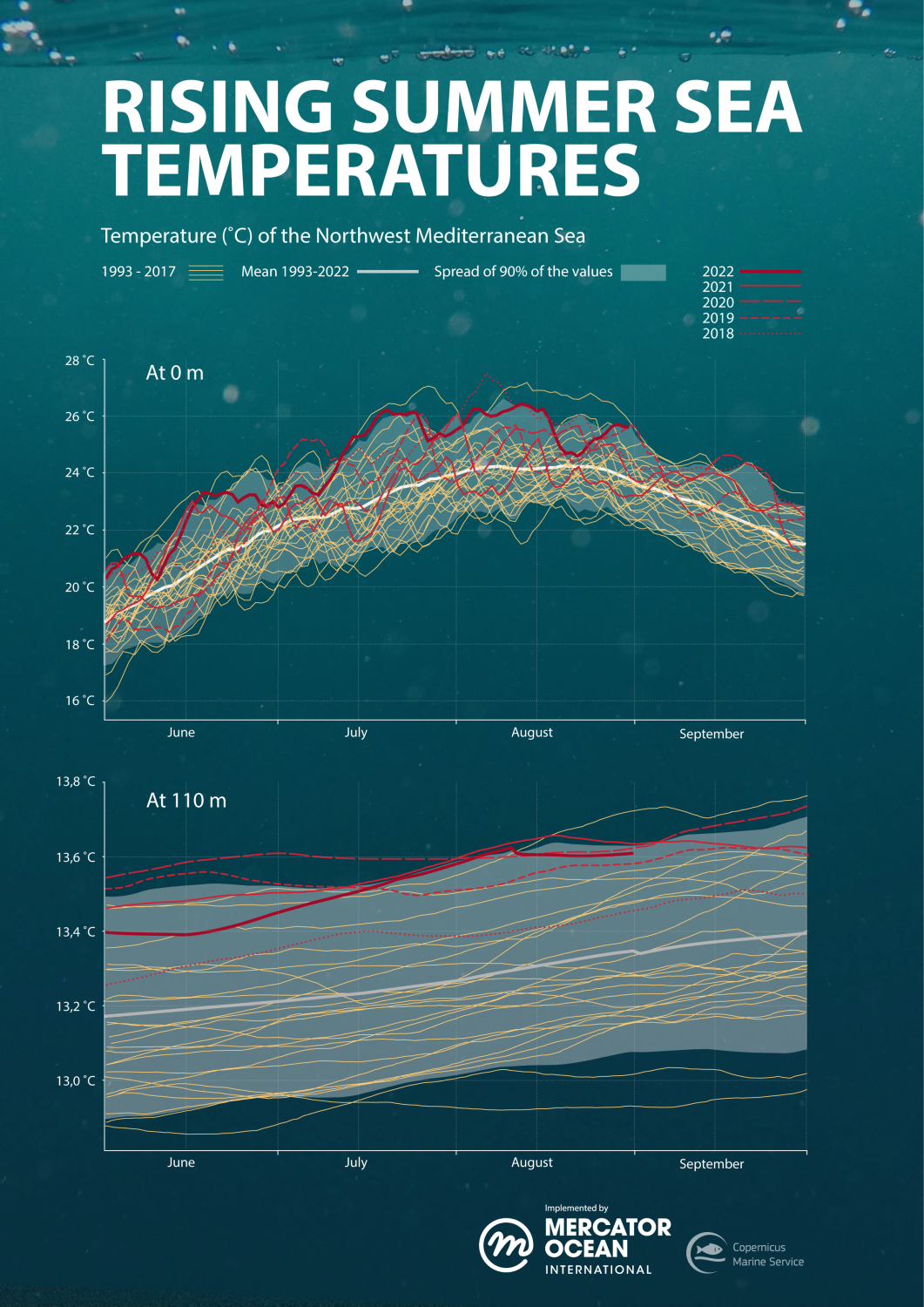
Using creative graphic design and programming, D&D created a new version of an infographic highlighting the rise in recent marine heatwaves in the Mediterranean Sea.
Challenge
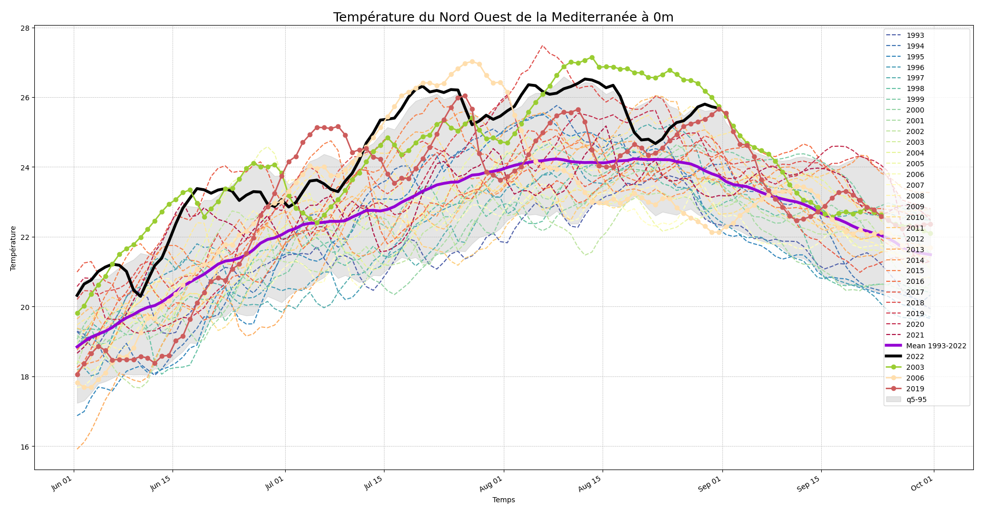
Mercator Ocean International requested Design & Data to create a graphic on rising sea temperatures, particularly in the Mediterranean Sea, that could accompany media articles related to marine heatwaves. The aim of this project was to make an existing set of graphs more comprehensible and visually pleasing so that both journalists and the general public could get more useful information from the visualised data. We were provided with the original graphics alongside the original data files in a CSV format. The challenge was figuring out how to convert the CSV data into an impactful infographic that could transmit useful and meaningful data in a more easily accessible way to a broad audience.
Idea, solution
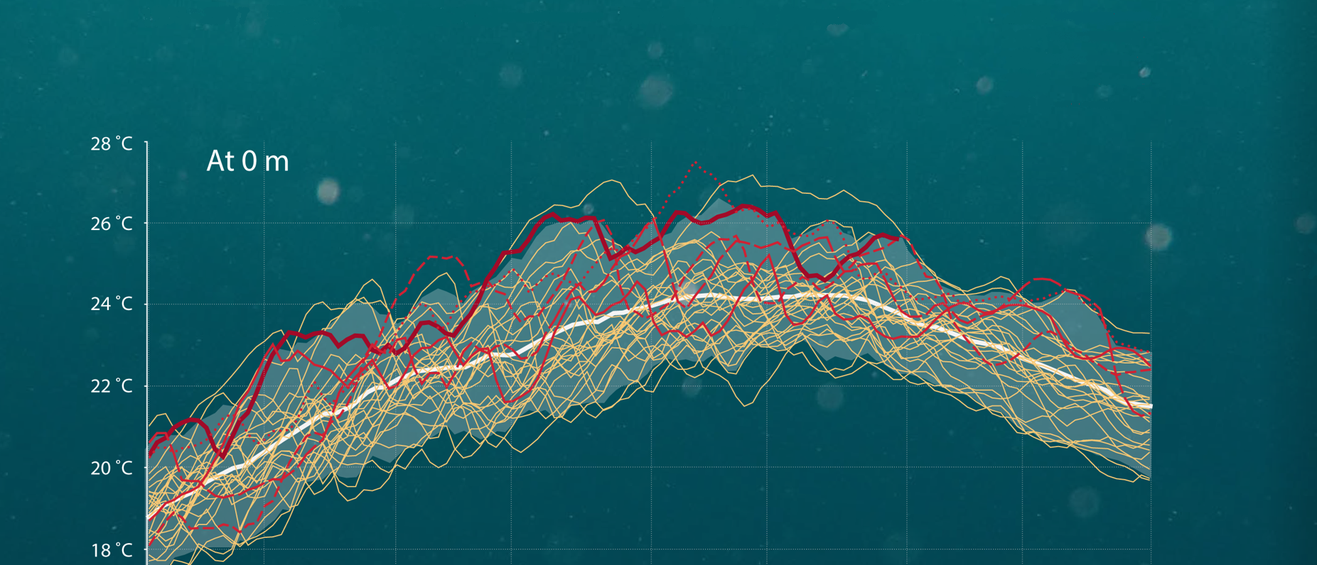
To start, our in-house programmer used the CSV file to develop the graphic, which was very similar to the original image that the client wanted to improve. Keeping in mind the need to share relevant data, we used creative colour coding to make the graphic easier to read. The 1993-2022 mean average trend was shown using a thick white line and the main values for marine heatwave temperatures over the last five years were shown in red, with thicker lines denoting more recent years. The values that were not as relevant to understand the trend of the last years were shown in yellow. By creating the graphic with colour coded lines, we highlighted the rising sea temperatures from the most recent years, making this data more relevant and easily digestible for journalists and general audiences.
Result
The final infographic was published in August 2022 by Mercator Ocean International as part of a press release on record-high marine heatwaves in the Mediterranean Sea for the summer of 2022. Instead of showing the data for every year from 1993 to 2022 in a different colour (original), we highlighted only the last five years, which showed how rising sea temperatures are becoming more extreme in an easy-to-understand format. A side-by-side comparison of the original graphics and the improved infographic are shown below.