Client
ECMWF
Field
Environmental Monitoring
Media
Online
Category
Design & Graphic
Location
Cologne
Year
2020
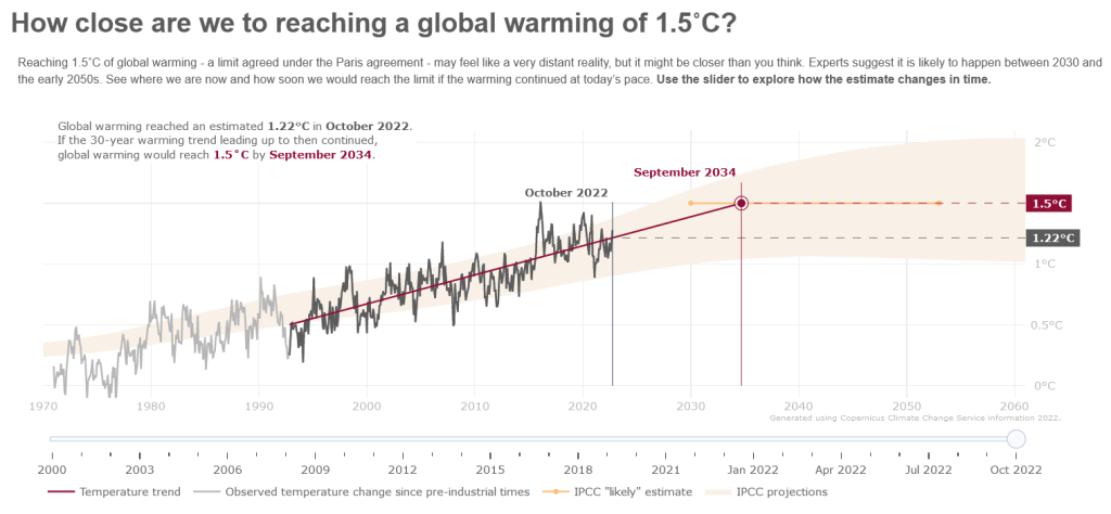
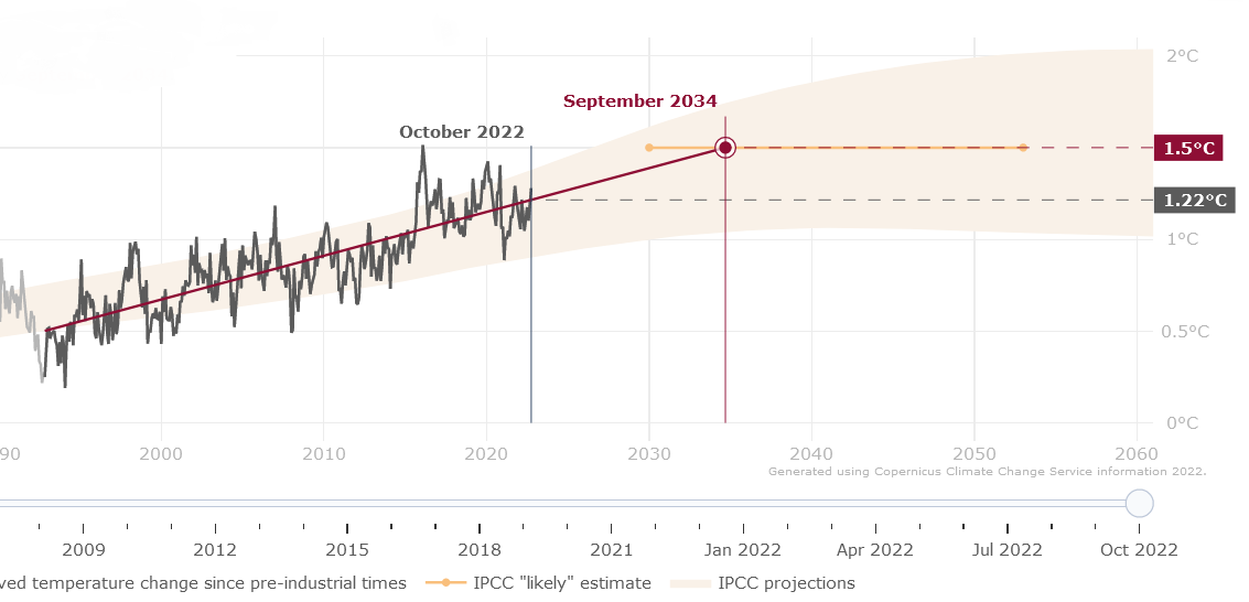
In a collaboration with ECMWF & B-Open, Design & Data developed an interactive application to visualise the current global warming trend in relation to reaching the globally adopted 1.5°C limit.
Challenge
For a new project for ECMWF, Design & Data partnered with B-Open – a software developer with expertise in environmental monitoring – to create an application for the Climate Data Store of the Copernicus Climate Change Service (CCS). The aim of this project was to develop an interactive resource and graphic based on extrapolated ERA5 Earth observation data that presented a statistical indication of when the agreed upon goal from the Paris Agreement of limiting global warming to 1.5°C would be reached if the current trend continued. Our challenge was to design the application in a way that would create a sense of urgency in the user and that could be used by both media and news outlets and the general public.
Idea, solution
Working closely with B-Open throughout the project, we initially created a series of concepts and mood boards for how the data could be visualized, which data the target audiences would find meaningful, and how to make the visual design engaging. To highlight the urgency of global warming data, the final application was designed to show the global warming trend using a red line accompanied by a gray staggered line highlighting monthly temperature levels. This trend was then accompanied by a possible trajectory (light yellow), based on projections from the IPCC, showing where the trend could go depending on the relative temperature data and steps humans take to minimize global temperature levels. The application also included a slider, allowing users to see the steep increase in temperature over time (1970s to present) and how the 1.5°C “day” changes based on the trend variation for any given month.
Result
The full application was published in the Copernicus Climate Data Store in 2020 and was recently featured on the main page of the CCS in 2022. It is important to note that this application is not a prediction of when the 1.5°C global warming limit will be reached. There are numerous factors that influence the red line and projected day. Instead, it is a visual definition of the current global warming trend, showing how past and current temperature increases have affected the rate and severity of the global warming trend